
Your pick, reworked:
THE LEOPARD
- Pick DIRTY or FILTHY.
- Tell V what else to change: the words, the crop, more dirt, less dirt, anything.
- Tick it in Band HQ when you are happy.
“I like the last ‘ocean Mary’ with the leopard but I don’t think it needs the 4 boxes. I rather the FB banner be full leopard with Ocean Mary in the middle. Also we need to give it a dirty layer or feel. It looks a little too clean cut and corporate. It doesn’t look like a ‘band’..it needs some grime ..if that’s makes sense. Give it a ‘cbgb’s’ kinda feel.”Mo, 17 October
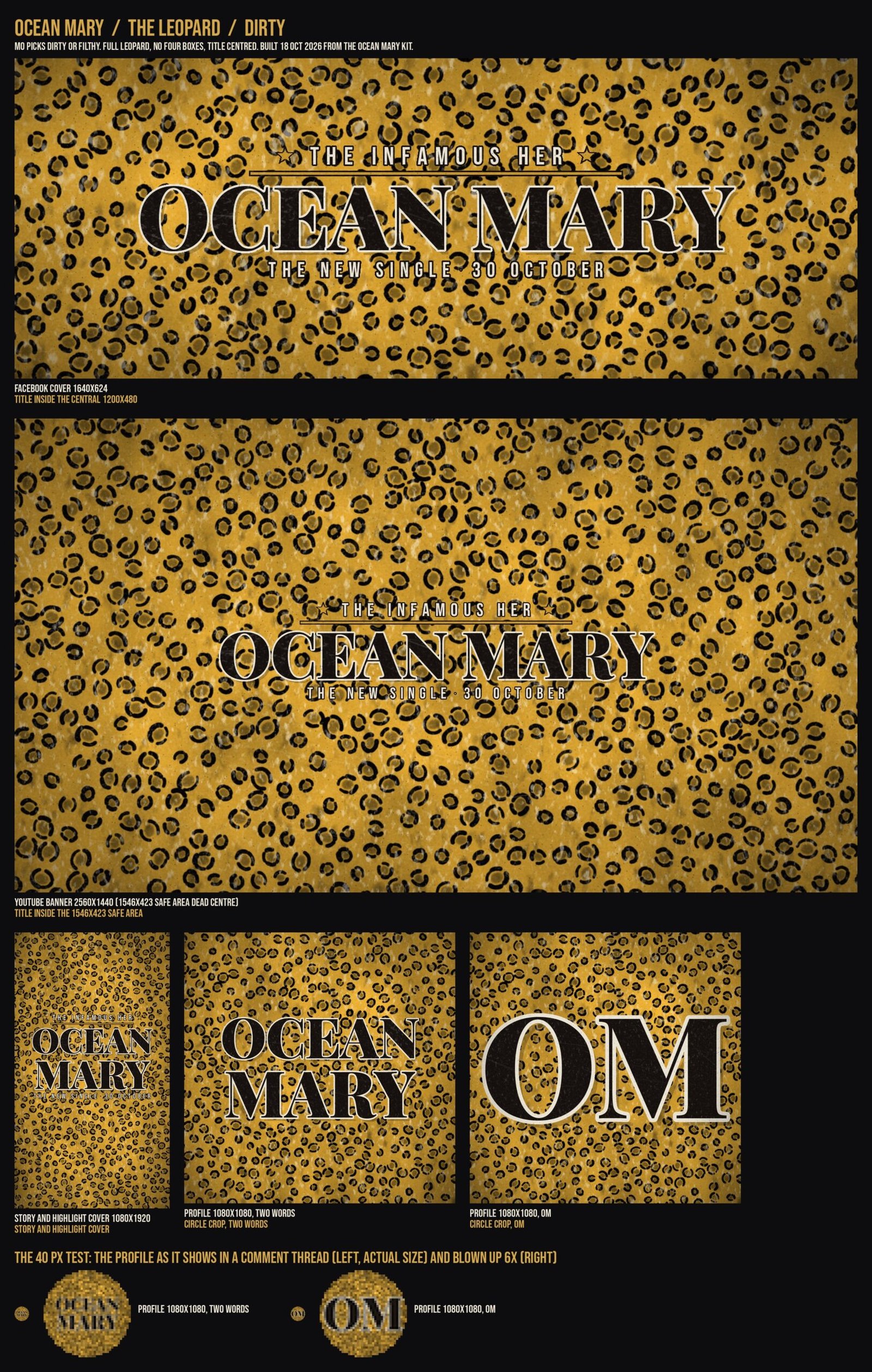
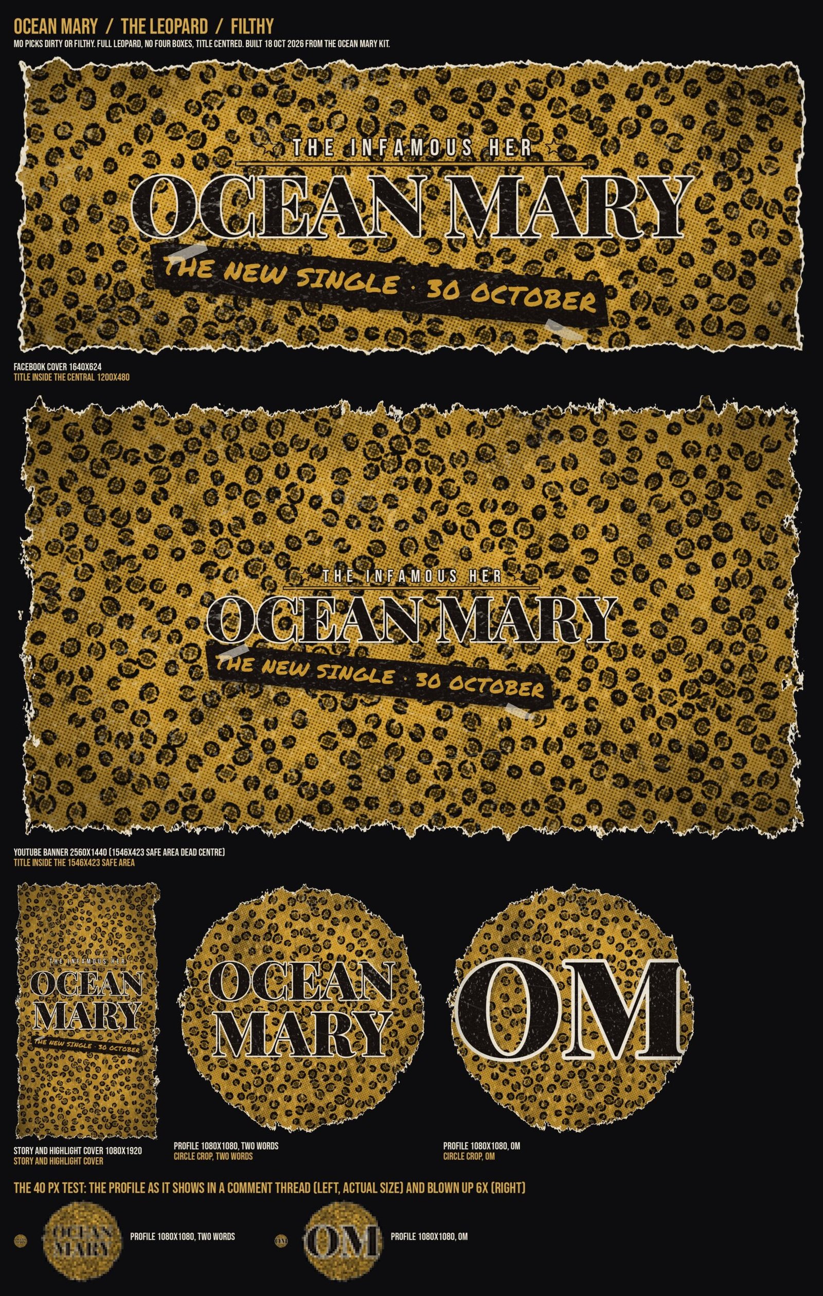
DIRTY is the leopard with dirt and wear over it, worn ink on the type, scuffs and darkened edges. FILTHY is all of that plus a bad-xerox halftone on the leopard, a torn paper edge, a taped-on marker stamp and a bone scuff layer: a photocopied club flyer.
Facebook cover / 1640 x 624
The title sits inside the central 1200 x 480, which is all a phone shows of a cover.


YouTube banner / 2560 x 1440
The dashed box is the 1546 x 423 safe area, the only part YouTube guarantees on every screen. The title sits dead centre inside it.


Profile picture / 1080 x 1080, circle crop
Two versions: OM, and the two words. The circle is how every platform crops it.


The 40 px test / what people see in a comment thread
The same files at the sizes the apps use: 40 px in a comment, 80 px in a feed, 150 px on the profile page. OM reads at every size; the two words turn to texture at 40 px, which is why OM is the recommendation for the profile. Your call.
Shown with the DIRTY files; FILTHY behaves the same at these sizes.
Story and highlight cover / 1080 x 1920


Everything on one sheet per strength: the DIRTY sheet the FILTHY sheet
What happens after you pick
Your pick goes up on Instagram, TikTok, YouTube and Facebook together: profile picture, Facebook cover, YouTube banner, story and highlight covers. It comes down on 30 November, when the single is out everywhere. Nothing on any channel changes before you tick.
Superseded / 14 October
The three directions you chose from, kept for reference. Your note came back on the third one, The Four Films; its leopard is the one above, now across everything.
Direction one / The Chart
The paper and ink of the Ocean Mary page, carried onto the channels. Old sea chart, IM Fell type, nothing shouting. Closest to the page the films live on, so a visitor who clicks through recognises where they landed. Risk: paper goes grey and muddy next to everyone else’s bright feed.
Mary
Direction two / Deep Water
Near black, one gold rule, Playfair at full weight. The least work to read at thumbnail size and the easiest to keep consistent across four channels. It also sits closest to the rest of the band’s look, so it survives past 30 November if you want to keep it. Risk: it is the safe one.
Mary
The dashed box is all YouTube guarantees to show on a phone. Everything outside it is decoration that most people never see, which is why the type sits dead centre.
Direction three / The Four Films
Your four faces, the actual frames from the films, as the background. It says what the campaign is rather than just naming the song, and it changes as each film opens. Risk: four small faces at banner size can read as a mess, and the profile picture has to carry the title on its own.
MARY
Mary
Back to Band HQ · The Ocean Mary page